


How can being fat be both good and bad?
How data cleaning can affect scientific results

I was recently listening to an episode of the wellness-industry debunking podcast Maintenance Phase that discussed the health ramifications of being classified as overweight or obese. The main story line of the episode follows a single data set collected by the CDC. Two researchers, both qualified, PhD-level scientists employed by the CDC, conducted statistical analysis on the data set, but reached opposite conclusions. One showed that being classified as overweight has a positive effect on mortality, while the other found the opposite. How is this possible? Mike and Aubrey break down the contributing factors of the issue in more detail than I am able to, but as a data scientist, the main thing that stuck out to me was the radically different ways the two scientists went about preprocessing the data.
“Data preprocessing” or “data cleaning” is the essential first step to conducting statistical analysis, and it is often joked that it is 80% of the work of solving any data science problem. When preprocessing data, the researcher will look at all the data in the set, consider the problem they are trying to solve and the domain they are working in, and decide what data to use in the analysis. Two of the biggest reasons why data is thrown out is because it is “bad” or because it contains additional variables that can muddy the results. Most cases of “bad” data are human error - if we get an entry that gives an adult man a weight of 15lbs, we can logically assume that someone forgot to type the last digit. However, we can’t know what that last digit is, so we have to get rid of that data point. Sometimes, this issue can be more complicated - we can see that something is off, but we can’t figure out why. Imagine we are doctors who weigh all our patients as they come in, and when we are analyzing data from last week we notice that on Wednesday the average weight was 10% lower than all other days. At that point, we need to go back and see if something was wrong with the scale. If it was, we have to throw out all that data. If we can’t see anything wrong with it, we need to do more statistical analysis to determine if this was just an anomaly, or if we are missing something and all the data from that day needs to be thrown out. These are the “bad data” cases that cause discussion in the scientific community, because although there are generally accepted guidelines to follow, they are broad and ambiguity can creep in.
The other reason we may chose to throw out the data is because we are worried that additional variables will affect the results of what we are investigating. This is what papers mean when they say the results “control for all additional factors”. If we are trying to determine the affect of obesity on mortality, we want to compare two groups that are identical except for their weight. This makes logical sense and is probably something you learned in a high-school level science class - we want to make sure it the obesity affecting the results, not the fact that half the people in non-obese group are smokers. However, actually implementing this can be difficult, especially when conducting experiments on people. What if the two factors are correlated? Smoking causes weight loss, so if we throw out all smokers, we just got rid of a lot of skinny people. Won’t if affect our results if we are comparing 10 skinny people to 100 obese people? This is where the debate comes in - does it make more sense to eliminate the smokers or keep them in? What if we didn’t ask the people if they are smokers?
This preprocessing is a necessary step; but, if the researcher is not careful to clearly communicate what has occurred, the essential context of what data is being considered and what conclusions can logically be drawn from that data can be lost. Alternatively, the researcher can get so lost in their own biases and preconceived notions that they can draw conclusions and see patterns that aren’t there. It is important to understand this issue because both of these cases can cause misinformation to spread as people make sweeping claims that are not backed up by data. You shouldn’t be ashamed if you have bought into stories like this - it is confusing even when people have the best intentions, and since science is always advancing we are constantly finding new ways to interpret data. In addition, remember that researchers are human too, and it can be easy to get caught up in the excitement of discovery and lose the overall thread of what the data is saying. The rest of this article will walk through how easily I can manipulate a census data set to show that countries with a larger area have a higher population than those with a smaller area.
I found a data set on the popular data science website Kaggle that contains information on the population, area, density, and net change in population over 2023, as well as what caused that change. In the interest of time I will assume that this data is correct. I have decided that I am going to investigate if there is a correlation between overall population and land area. A negative correlation would mean that as population increases, land area decreases; a positive correlation means that as population increases, land area also increases. No correlation means that there is no pattern between the two. My theory is that larger land area would lead to more farming, thus causing populations to grow at a higher rate. I have am doing this analysis because I am planning to use the results in an application for a grant to continue my research. The metric I will use to measure the correlation is the Pearson correlation coefficient. It varies between -1 and 1, where -1 means perfectly negatively correlated, 0 means no correlation, and 1 means perfectly positively correlated. I decide to start by creating a scatter plot and calculating the metric for population and land area for all countries, in the hope it will reveal a pattern.
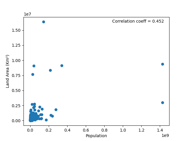
A correlation coefficient of 0.452 shows some promise, but I don’t like that there are some dots on the graph that are far away from the cluster in the lower left. I decide to do a time-honored data preprocessing step - eliminating outliers. There are some countries, such as Russia, that are so large we can assume that they do not represent the rest of the world, and thus they should be excluded from the analysis. This is common practice, although the method for determining what is an “outlier” can vary. For now, let’s say that any country with a population or area three times greater than the mean is out.

This gives us a minor boost, to a correlation coefficient of 0.49. Also, notice how the axis on our graph have changed, so now we look more zoomed in on the lower left corner. However, now I’m worried that additional variables are affecting my results. It seems logical to me that countries that currently have wars being fought on their lands should be excluded from this analysis, since their populations are undergoing a big change and are probably not reflective of overall trends. We want to compare countries that are identical except for their land area. Again in the interest of time, I find this website listing all countries at war, assume it is right, and exclude them from my analysis.

This has a negligible effect, but it has inspired me - any variables that causes a major change in population is going to affect our results and should be excluded. Let’s only look look at countries that are stable in overall population, with a year-to-year change of less than 1%. Remember, we want to compare countries that are roughly identical except for land area, and it can be hard to determine the population with accuracy if there has been a dramatic year-to-year change.
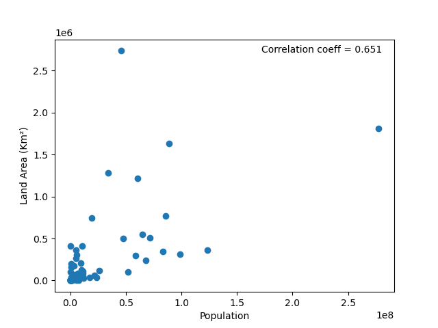
What a big change! Now I have a correlation score of 0.651. I’m on a roll - won’t a big change in migrants also affect our results? We want to see only the effect of land area, not migration. Let’s get rid of all countries that had a net change of more than ten thousand migrants in the past year.

What an even bigger correlation! A score of 0.818 shows a clear correlation, and now I can write my grant application showing that my theory was correct, a larger land area does correlate to a larger population, the data shows it!
But is that what the data is really saying? I made many questionable assumptions above that I am sure caused sociologists, historians, and a number of other professionals to cringe with embarrassment, but even if all these assumptions were correct, can I still make the sweeping claim that larger area equals larger population? The graph below plots the our final, cleaned data set on top of the original raw data - look at how much we threw out! We started off with 234 countries and ended with 83. After “controlling for all additional variables”, do we even have a representative data set left?

Using the analysis above, it is mathematically true that this correlation exists when comparing “equal” countries, but “equal” countries don’t exist in the real world - Russia is real, and there are lots countries with a lot of year-to-year change in population or a large contingent of migrants. This result may be mathematically useful, but in terms of applying it to the real world, it is important to place it in the large context of the preprocessing we have done and the limitations of our results. We can use this to influence our thoughts and actions, but it should not be taken as Gospel truth because the real world is messy and contains additional variables.