My original plan for this article was to walk through and visualize several types of statistics that are often used in news articles, such as “15% more likely”, but when I started researching, I realized that I was incorrect about what metrics such as “5 times more likely” actually meant. Digging deeper, I found that this type of metric had a name - likelihood ratio - and was complicated enough to merit its own post.
Likelihood ratios appear often in news articles or informative websites, such as the CDC page on lung cancer risk factors, which states that smokers are 15 to 30 times more likely to get lung cancer when compared to non-smokers [1]. They don’t list the methodology about how they get such a wide range, but my previous article goes into detail about how this can occur.
Reporting information like that to the general public can be beneficial due to its interpretability- it is clear that smoking causes lung cancer, and the CDC doesn’t want you to smoke. Reporting more complicated statistics, such as the r-squared value or Pearson correlation coeffient, doesn’t pack the same punch. However, one drawback is that it is not immediately clear where such a number comes from, and this can make it difficult to determine how to react when being confronted with them. Are all smokers going to die? How often do people who don’t smoke get lung cancer? As I mentioned above, I didn’t know what it meant, and I work with statistics every day, albeit in a different field. For the rest of this article, I am going to walk through how the CDC got this number.
In order to talk about likelihood ratios, we need to first talk about two different metrics - sensitivity and specificity. In lots of scientific research, the sort of statistics learned in middle and high school are good enough to quantify performance. A Facebook algorithm may say it can accurately classify 95% of faces, or a baseball coach will keep track of his player’s batting averages to see who is best. However, there are some cases where this is not good enough. According to the CDC, there were 197,453 new cases of lung cancer diagnosed in the US in 2020 [2]. This may seem like a lot, until you consider the 259 million adults that were living there at the time [3]. That means that only about 0.06% of the population had lung cancer in 2020. So, we can easily predict if someone has lung cancer with 99.94% accuracy by just answering “no” every time, because most people (thankfully) don’t have lung cancer.
Obviously, accuracy is not a good metric here. We need something else that captures two important facts about our situation - i) it is really bad if we miss diagnosing someone’s cancer (false negative) , and ii) we don’t want to tell people they have cancer if they actually don’t (false positive). So, instead of reporting an overall accuracy for our test, we should instead be examining how it answers two questions:
Out of all the people our test said had cancer, how many of them actually had cancer?
Out of the all the people that don’t have cancer, how many of them did our test predict they should have cancer?
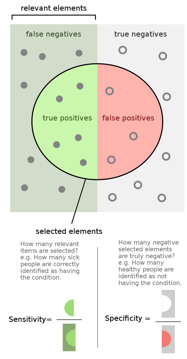
These two questions are quantified in the metrics sensitivity and specificity, and once again Wikipedia has a great infographic [4]:
For those more math-minded, the actual equations are:
where TP = true positive, FP = false positive, TN = true negative, FN = false negative. You may also know sensitivity as the “true positive rate” and specificity as “true negative rate”.
Although it’s easiest to motivate these metrics by considering the diagnostic test example above, they can actually be applied to any variable. So, if we want to examine the impact of smoking on lung cancer rates, we can can consider a “true positive” someone who smokes and has lung cancer, a “false positive” someone who doesn’t smoke and still gets lung cancer, a “true negative” a person who doesn’t smoke and doesn’t get lung cancer, and a “false negative” a person who smokes but doesn’t get lung cancer.
Now that we know those metrics, we can easily understand likelihood ratios. The positive likelihood ratio (LR+), which is the one used by the CDC to get the 15 - 30x number is simply:
This makes sense if we break down the parts: “sensitivity” of our variable says, “out of all the people who smoke, how many of them get lung cancer?”, while “1 - specificity” says, “out of all the people who don’t smoke, how many of them have lung cancer”? So, if mostly people who smoke get lung cancer, our numerator will be very large, while our denominator will be close to 0, resulting in a higher likelihood ratio. This makes sense - it is telling us that smoking is a risk factor for lung cancer. Alternatively, if lung cancer cases are spread evenly among smokers and non-spokers, we will get a small likelihood ratio, meaning that smoking is not a risk factor. So, using sources [2] and [3], which provide population, number of cancer cases, and a worst-case estimate of 80% of people with lung cancer being smokers, we can construct this table:
This leads to the sensitivity:
Specificity:
And likelihood ratio:
So our likelihood ratio is even worse than the CDC! I actually am not surprised by this - we are using recent 2020 data, where everything was warped by the pandemic, and there are significantly less smokers than when the inital studies that established these numbers were done. Still, this is a useful exercise to complete because provides a deeper understanding of a statistic often used in media.
References
https://www.cdc.gov/cancer/lung/basic_info/risk_factors.htm
https://gis.cdc.gov/Cancer/USCS/#/AtAGlance/
https://www.census.gov/quickfacts/fact/table/US/PST045223\
By FeanDoe - Modified version from Walber's Precision and Recall https://commons.wikimedia.org/wiki/File:Precisionrecall.svg, CC BY-SA 4.0, https://commons.wikimedia.org/w/index.php?curid=94134880


