Math is often considered to be unbiased, and the general public is trained to simply believe any statistical figure quoted at them by a seemingly reputable source. However, even in cases such as simple physics diagrams where all data could be unbiased and apolitical, the presentation of data always reflects an ulterior motive. When I am creating graphs and diagrams for presentations at work, I am always asking myself the questions “What am I trying to convey with this graphic?” and “What do I want the customer to do with this information?”. There is nothing inherently wrong with this - it is the responsibility of the scientific expert to distill their experiments into information the layperson can digest and incorporate into their own life. The issues come in when the display of the data is manipulated in such a way that it no longer reflects what was actually discovered, or when public figures of all stripes willfully misrepresent the data for their own purposes.
This article will discuss different ways an example data set can be represented in a newspaper article using just a bar graph, and which are accurate representations of the data. We will pretend I have interviewed 15000 college girls and asked one question:
“Which of the following reality TV shows have you watched at least one episode of in the last year? (check all that apply)”
The Bachelor
The Bachelorette
Love is Blind
Love Island
The responses are shown in the table below.
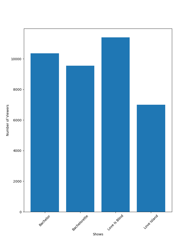
Due to the small number of data points in our set, the chart is interpretable and could be easily used in our final article. However, I have decided that it is not exciting enough and I want a graph to communicate this data instead. If the goal of my article is to convey that a large percentage of college-aged girls regularly watch reality television, I can make a basic bar graph showing the raw viewership numbers, such as the one below:
I could also be more direct and plot the percentage of “yes” responses instead, like in this graph:

Due to our choice of setting the Y axis at 0, it looks as if all four shows have similar viewership numbers, and those numbers represent a plurality of college-aged girls. We have not done any data manipulation, and the Y axis counts are evenly spaced. Both of these graphs will allow me to write my article about how many college girls love reality TV, and they both accurately represent the answer to the question “How many yes responses did I get for each show"?”
Let’s say I now decide to take a different tack - I applied to be on Love Island and was rejected, so now I want to write an article about how Love Island is the least popular reality show among college-aged girls. This can be accomplished by simply adjusting the range of our Y-axis to get the following graph:

Again, this graph is an accurate representation of the data, but now instead of highlighting the large percentage of “yes” responses overall, it is now highlighting the differences in “yeses” between different shows. This would be a fair graph to use in the article.
However, let’s say I am really vindictive and decide to go even further. I combine the responses for the Bachelor and the Bachelorette into on category, like this:

This has now crossed a line, and I am misrepresenting the data for my own purposes. Our original graphs were answering the question “Out of 15000 college-aged girls, how many of them said they watched this show?”. The graph about does not answer this question for the “All Bachelor” show, since we now have 30000 possible “yeses” for that bar, but only 15000 for the other shows. This can be visualized by using percentages again:

Clearly, it does not make sense that we could have more than 100% response rate. This graph is no longer a fair representation of our results, and it is irresponsible to publish it as such. If I really have it out for Love Island, I can re-compute my data to get the number of people who responded “yes” to either Bachelor, Bachelorette, or both and get this graph:

This graph is slightly less misleading than the previous one, since we are comparing the exact percentages. However, it is still confusing because one of the bars represents two possible shows, while the other ones only represent one.
Let’s pretend now that my editor catches this and says I need to cut the graph since it is misleading. I am still angry, so I mess around with the Y axis of the graph and produce this:
This graph has been exaggerated for effect, but the manipulation of axes in this way is so common that it has its own name, Lie Factor. The Lie Factor states that in order to create an accurate graph, the size of the effect in the data must be proportional to the size of the graph. If the Bachelor is twice as popular as Love Island, the bar representing it much be twice as big as the Love Island bar, not four times. Again, this graph is not an accurate representation of the data and should not be printed as such.
Below, I have plotted all the graphs discussed in a single image - I am always amazed at how many different ways the same data can be represented and the different reactions they elicit. Whenever I read anything with graphics, I have to force myself to think of these factors because it is so easy to be taken in by the narrative. For more information, I recommend the classic The Visual Display of Quantitiative Information by Edward Tufte.


